
Fuel the doer.
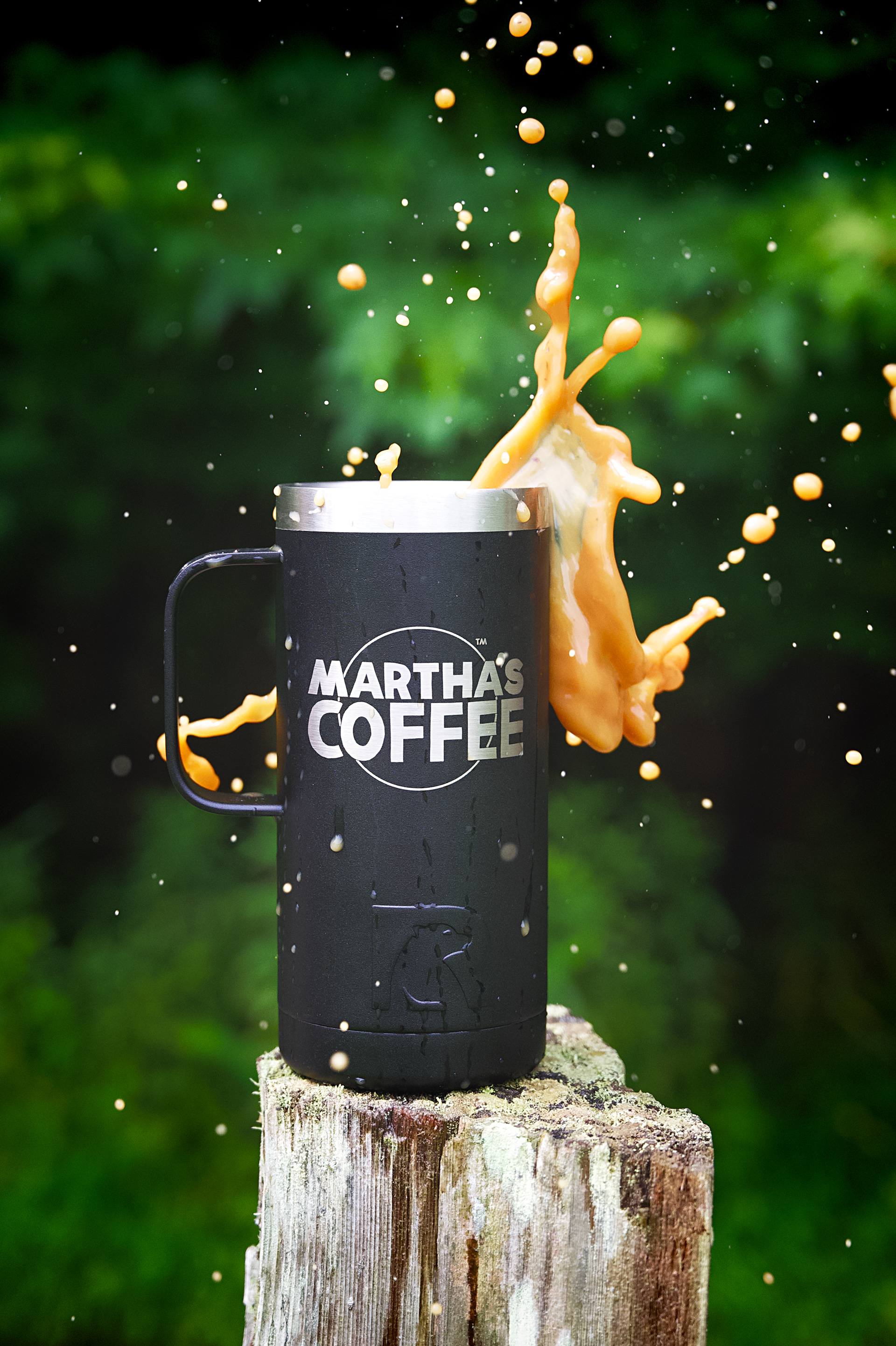
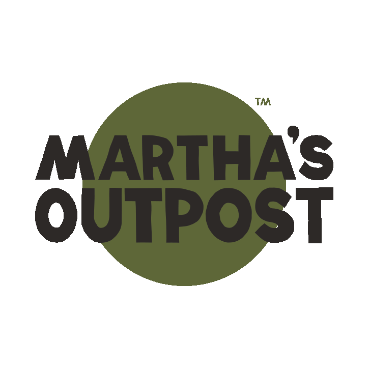
A highly caffeinated brand identity & creation
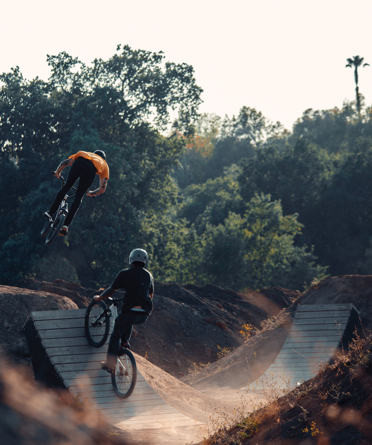
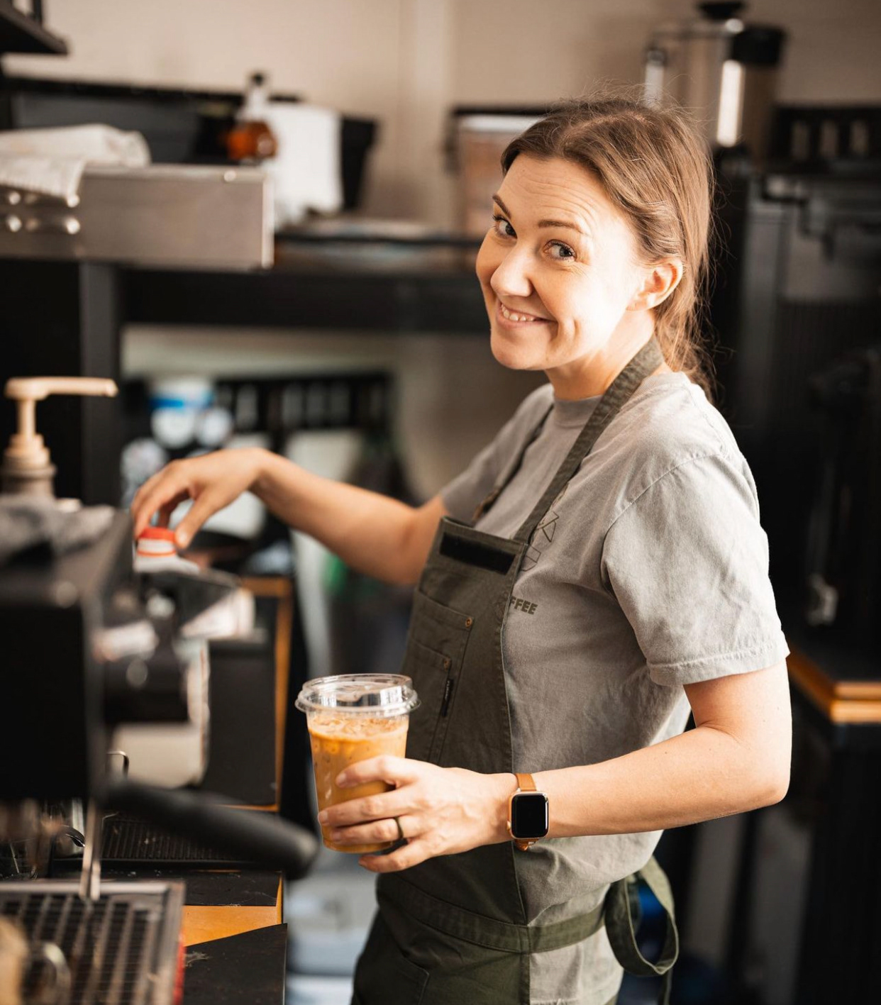
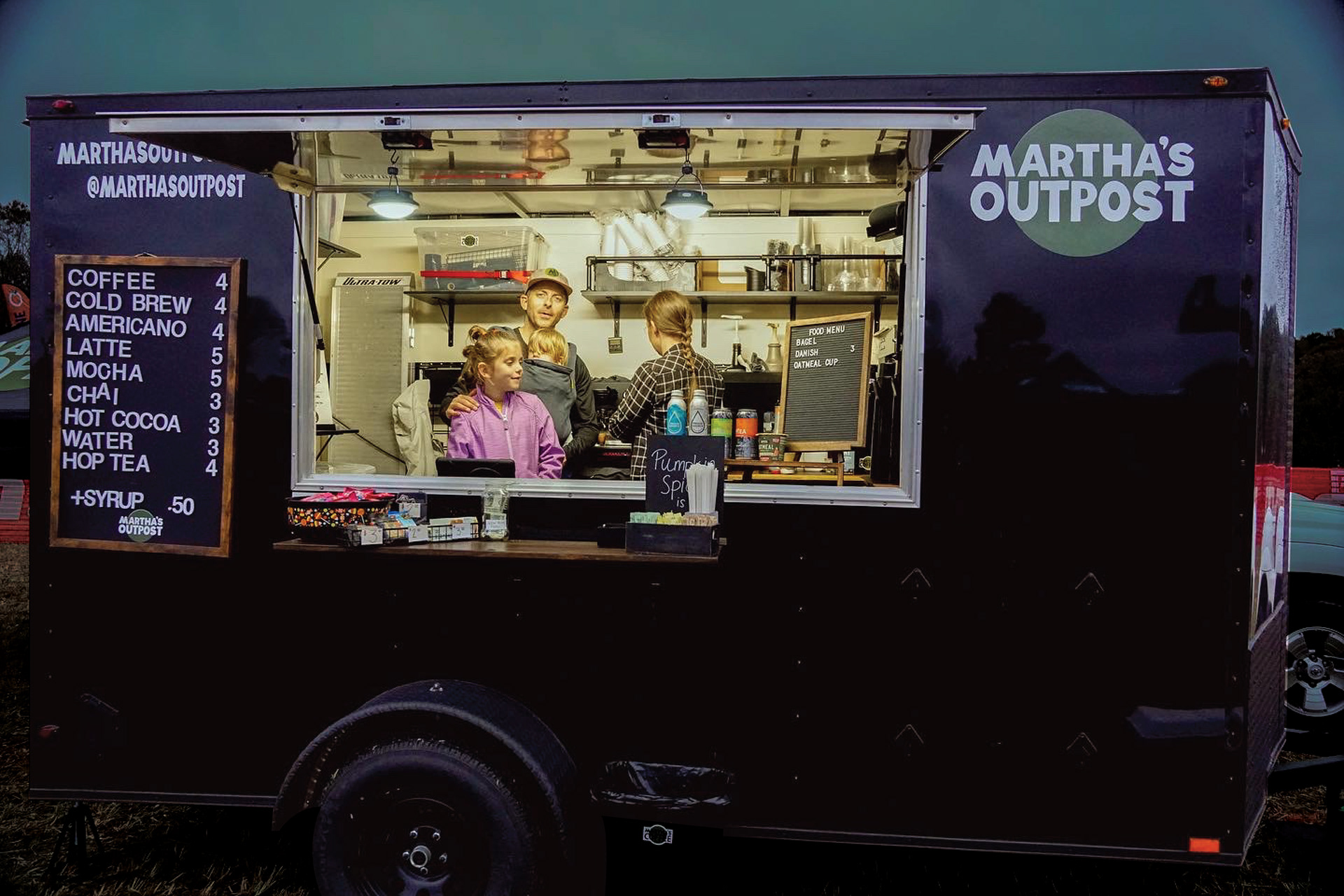
What's better than enjoying a freshly crafted americano while sniffing fresh air? If you're a nature and coffee junkie, then probably nothing. With a mobile coffee trailer, Martha's Outpost fuels the outdoor recreational community... bike, paddle, hike, sip. We were tasked with bringing the brand's purpose to life.
DELIVERABLES:
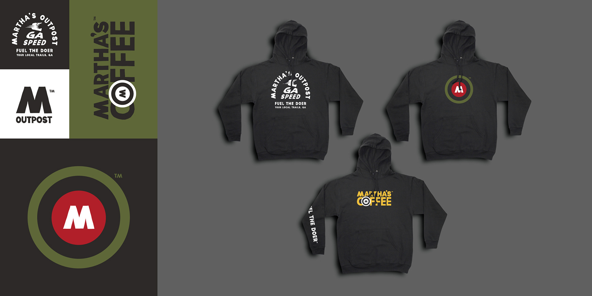
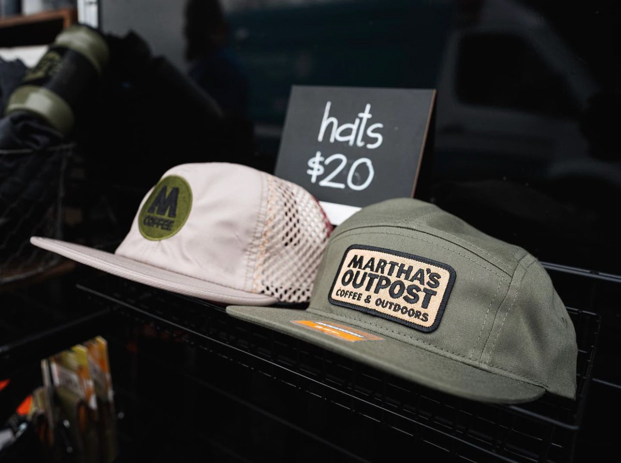
◍ Brand identity ◍ Creative Direction ◍ Logo development ◍ Digital & physical asset production
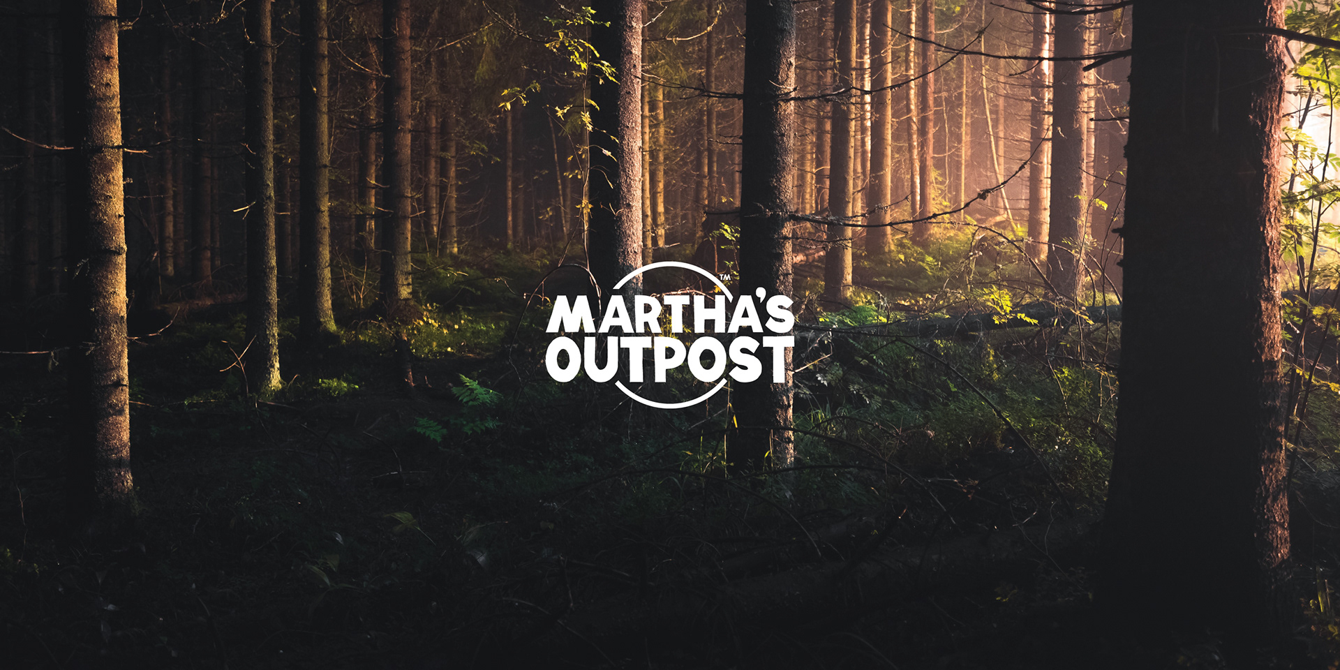
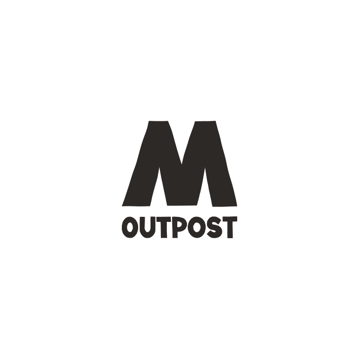
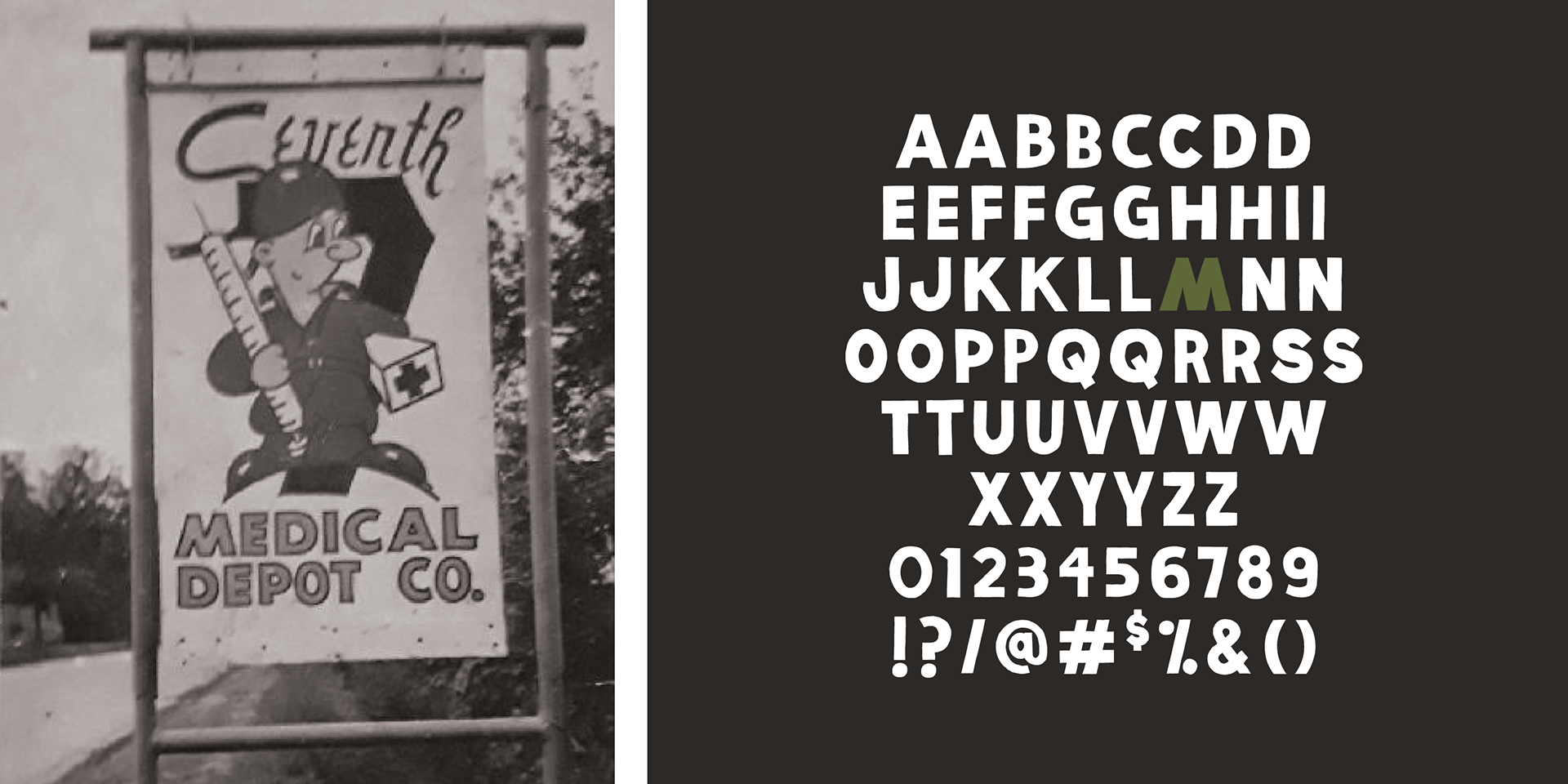
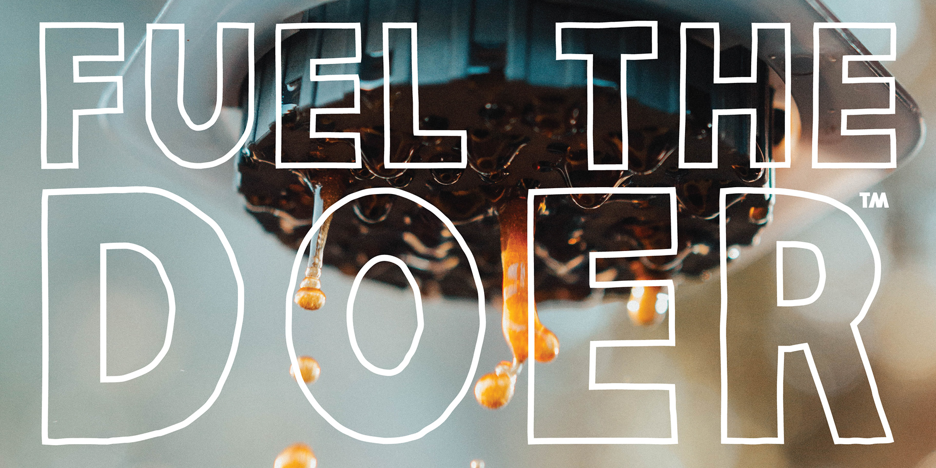
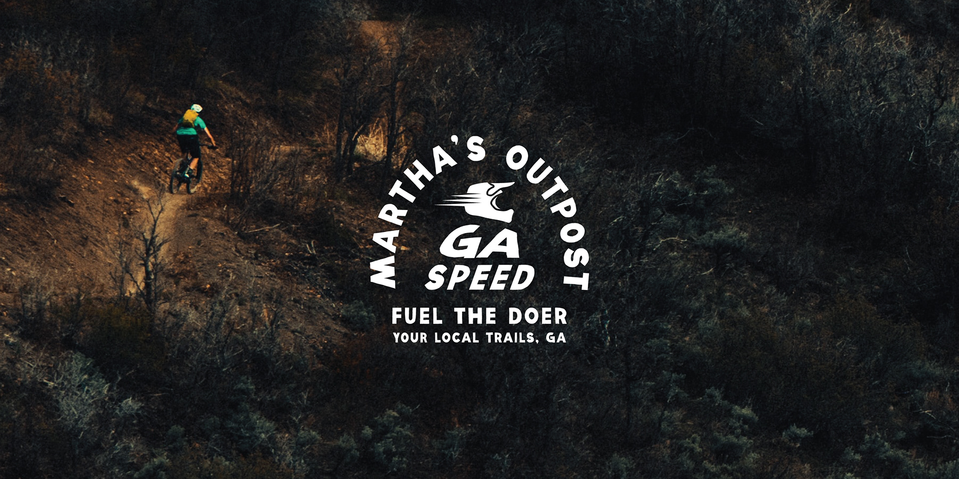
The Martha Sans custom typeface (available in Bold and Outline) was created to match the lettering from a sign the founder's grandfather painted. Each letter has a second iteration to achieve a hand-drawn aesthetic, except for the letter 'M', for a strong consistent visual identity when used in a solo setting.